
Improving collaborative clinical decision-making in cancer care
- a web platform to help physicians and patients in choosing the treatment for cancer
Duration
May 2024 - May 2025
Role
UX Design Intern
Team
UX Designer (me),
UX Researcher,
Data Engineer,
Project Manager,
3 Physicians (subject-matter experts)
Contribution
UX Design,
Interaction Design,
Strategic Decisions,
Critical Thinking,
Usability Testing
Problem Space
When diagnosed with cancer, making informed decisions about the treatment can feel daunting and confusing.
When a patient is diagnosed with cancer, it often triggers significant emotional distress. During this vulnerable time, patients are expected to absorb complex information about their diagnosis, which can be overwhelming and mentally exhausting. These conversations are typically lengthy, and while physicians aim to provide comprehensive explanations, they face the challenge of doing so without further overwhelming the patient.
here's what happens
Diagnosed with cancer
A doctor says
"You have cancer" and for you, everything changes.
The emotional weight increases
Emotions take over - fear, confusion, denial. But there’s just little time to process it.
There is an information overload
You are expected to understand complex medical information quickly.
The Decision Dilemma
What is the best path? What gives me the best chance? How should I decide?
Physician’s Challenge: He wants to help, but how should he without exhausting you who are already struggling?
Concept
Designing a comprehensive cancer care roadmap that supports patients from the moment of diagnosis through post-treatment home care with the goal of guiding patients through their care journey with clarity, empathy, and informed decision-making.
My focus
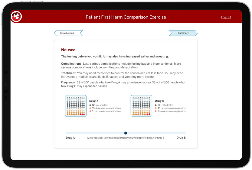
At the core of the experience is a "Patient First Exercise", a set of interactive cards that present the harms and benefits of each available treatment option.
Patients review these cards to understand the potential outcomes (both positive and negative) of each treatment and indicate their personal preferences for acceptance. This input is then used to prioritize treatment options that align with the patient’s values, lifestyle, and tolerance levels, ensuring that the recommended approach is not only medically sound but also personally acceptable.
Design Goal
Design the cards with an optimal balance of information.
Clear and concise, avoiding overload
Visually intuitive, supporting quick comprehension
Aimed at helping patients make well-informed decisions
Emotionally sensitive, given the context of use
The designs are NDA-bound, but the journey’s all mine to share :)
Understood problem space & concept
Translated concept into design opportunities
Developed 4 design variations
A/B User Test: 40 participants
Determined optimal information level
Expert Validation with physicians: 17 participants
Iterated to solve 5 usability issues
Usability Test: 10 participants
Designed the entire set of harm & benefit cards
Outcome
All physicians expressed strong enthusiasm to adopt it in real-world practice.
The concept was tested with physicians through simulated user studies. All of them expressed strong enthusiasm, highlighting its potential to save time and support patients in navigating critical treatment decisions without feeling overwhelmed.